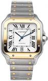
The gold Santos de Cartier stands as one of the most recognizable silhouettes in fine watchmaking, distinguished by its square case, exposed screws, and flowing Roman numerals. First conceived in 1904 for Brazilian aviator Alberto Santos-Dumont, this model carries a legacy that predates many of the maison's other famed creations. In its precious yellow gold iterations, the watch takes on an even more commanding presence, balancing its aviation roots with the warmth of a dressier, high-jewellery aesthetic.
When the topic of yellow gold wristwatches arises, comparisons with other luxury maisons are inevitable. The Santos, by contrast, uses gold not merely as a material but as a canvas for geometric expression. The case is an architectural marvel, and the bracelet design, with its integrated links, carries a consistency that makes the entire piece appear as a single sculptural object. For those exploring precious metal timepieces beyond the Cartier catalogue, including the yellow gold Rolex collection, the philosophical differences in case engineering and design language become immediately apparent.
A Design Language Built on Geometry and Light
The visual identity of the Santos revolves around its defining structure. Where many round dress watches rely on the continuous curve of a bezel, the Santos pivots on straight lines and sharp corners. This angular approach, unusual for a dressier timepiece, creates a distinct wrist presence that has remained essentially unchanged for over a century.
In yellow gold, the faceted bezel captures light differently depending on the hour of day. During bright daylight, the polished gold surfaces throw brilliant, warm reflections. In lower-light settings, the same case can appear muted and understated. This dual character gives the watch unusual versatility for those who favour fewer, higher-quality pieces in rotation.
The dial also adheres to a strict geometric code. The Roman numeral set, arranged in a square configuration, echoes the shape of the bezel and creates a unified design statement. On certain dial variants, the black or silver backdrop contrasts sharply with the gilded hands, ensuring legibility while preserving the period-appropriate character that many collectors admire in historical catalogues.
Understanding the Movement within the Santos Case
Behind the visual beauty lies a story of mechanical evolution. Modern versions of the gold Santos house self-winding movements crafted by the maison's own manufacture. These calibres include practical upgrades such as enhanced power reserve and improved resistance to magnetic fields, a nod to the clinical and airborne environments where such instruments historically operated.
For purists, the Santos family's most significant innovation in recent decades involved the quick-swap strap system, known as SmartLink. Although such practical conveniences are often polarising among horology loyalists who prefer a more traditional approach, the ability to resize the bracelet without tools has broadened the watch's appeal. Every link, including those crafted in yellow gold, carries exceptional finishing quality, guaranteeing that the metal's lustre is matched by the precision of its machining.
The 1970s Redesign and the Rise of the Bracelet
Although the Santos dates back further, the stainless-steel-and-gold redesign of the late 1970s elevated it into the luxury sport category at a moment when the industry was moving toward integrated bracelets. That era introduced the concept of gold editions with the distinctive rectangular links, setting a new template for elegant everyday wear.
Today's gold references continue this lineage. They offer wearers a piece of historical continuity that remains uniquely identifiable across any room.
How the Gold Santos Fits within the Broader Cartier Portfolio
Within Cartier's broader luxury portfolio, the Santos occupies a central place alongside the Tank. While the Tank is often viewed as the quintessential dress watch, the Santos assumes a role that is slightly more active. Those charms have historically allowed it to transition from boardroom to dinner without disharmony.
Yellow gold versions inject an extra layer of sartorial interest. They are assertive without shouting. Collectors seeking variety while remaining within the house style often acquire versions of the Santos in both steel and gold to access completely different portions of their wardrobe palette.
Collectors may also draw parallels with other strong designs that follow the square aesthetic. Some may appreciate how a square-cased chronograph offers a different ode to angularity with its motorsport focus, where visual singularity serves tactical objectives, whereas the Santos presents a softer, dress-oriented interpretation of the same design principle.
Considering Weight, Wearability, and Everyday Practicality
Gold is a heavy material, and wearing a full yellow gold watch requires adjustment. Such pieces are marketed not merely as instruments, but as significant physical objects on the wrist. The Santos case, with its moderate thickness, does not wear as large as its shape suggests.
For everyday wearers who plan to use the timepiece extensively, gold represents a higher standard of care. The metal is inherently softer than steel, meaning surface scratches may appear with active daily use. Many owners appreciate this trait as a patina effect, with the passage of time being demonstrated on the very case itself.
The longer gold bracelet adds gravitational presence. Cartier has engineered the weight distribution across the wrist to be remarkably balanced, minimizing instances of the case tilting sideways. This is essential when competing for comfort against heavier gold references from competing brands known for substantial weight.
For individuals with significant fine-watch holdings, the gold Santos is typically classified under categories linked directly to heritage or jewellery-driven pieces.
Markers of Authenticity on the Market
Whether considering a new purchase or exploring the pre-owned segment, buyers commonly focus on certain authenticity markers unique to the modern Santos family. The seven-sided crown protects both movement reliability and gives way to a small blue cabochon, one of the maison's hallmarks. Any compromise on this fine detail immediately draws red flags amongst aficionados.
Another peculiar anomaly is the date display placement on some mid-sized versions. Slight offset dials in mismatched vintage examples indicate refinished or non-original surfaces. Although valuable as reading material, professional authentication should always precede any gold watch acquisition.
Why the Gold Version Becomes a Diversification Pillar for Collectors
Collector portfolios diversified across steel, ceramic and leather-strapped sports pieces find distinct joy in higher-content gold additions. Vintage gold aesthetics offer long-run appreciation potential. Younger, precious metal designs remain consistently buoyant.
A shared fascination emerges when pairing the gold styling with comparable models, such as some distinct yellow-gold references in modern chronograph collections. Selecting a square, integrated bracelet in gold removes discussion from nautical depth measurements or anti-magnetic certificates and returns the conversation to simple values centered in wearable beauty and finishing quality.
Acquiring gold under French stylistic laws is selecting a distinct segment not repeated naturally. Returning a focused gaze to global wardrobes, stylish gold pieces anchor wardrobes, enhancing tones, complementing tailored suiting, and even becoming occasional bringers of high contrast looks within casual denim contexts.
The gold Santos de Cartier is markedly feminine or masculine via proportion selection, from larger complications in gold, expressive with gem setting, through stable, medium executions worn daily.
Readily set apart from simpler instances, pieces are displayed across websites on light aesthetic backgrounds to highlight or minimize polished sharp contrast. Yet, daily presence consolidates itself, not form only, but history balanced with brilliance, linking successive purchasers generationally, bearing testimony that the most penetrating statements arrive fully squared and gold.
 Exciting, Best Luxury Watches for Sale!